Blog:

Facility Graphics

Just as the fall athletic season is settling in and contenders are separating from pretenders, it is time to start thinking ahead to the winter athletic season. Most fall purchases have been made, and now focus shifts to the winter sports. Don’t miss your opportunity to make an awesome first impression and amplify fan experience.
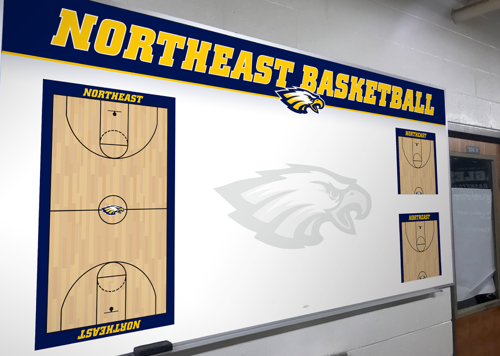
On the court, your team won’t succeed without strong, united communication. But what about off the court? Many coaches assume that verbal repetition is enough to get their message across, but sometimes it’s not enough to simply tell your athletes what you want from them.
In high school, I had a coach who would always say “If you’re on time, then you’re late.” At first thought, this may not seem to make much sense, but he was trying to share a very important message with his players: show up early, be prepared to play, and make the best use of your time.
Finding innovative ways to add additional colors and branding elements to an athletic facility may seem like a daunting task. How large should it be? Should we add photos? What are we trying to accomplish with these graphics? These are examples of some of the questions that are asked when considering a graphics project like the one recently completed at Indian Hill High School.
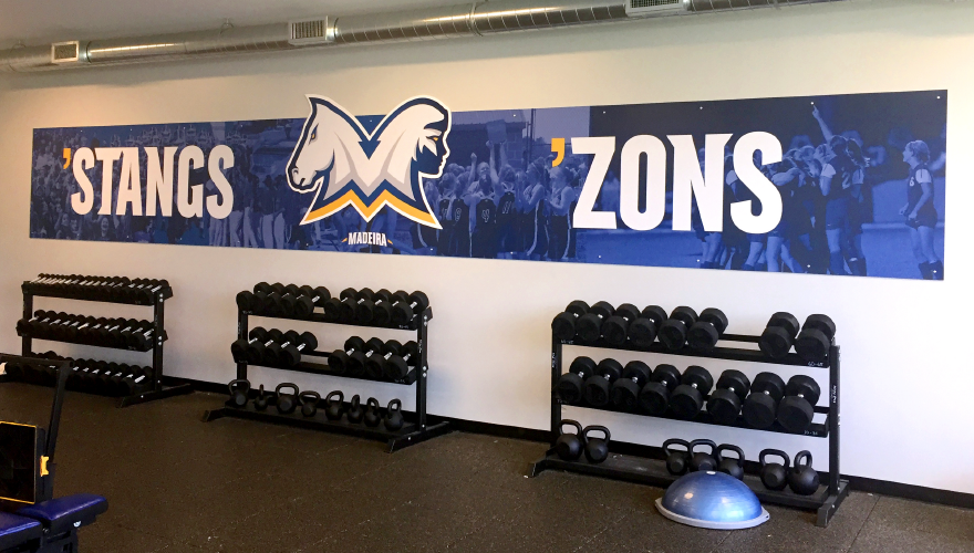
Back in July 2015, the Madeira Planning Commission unanimously approved a new fitness center and weight room facility to be built attached to the existing Madeira High School. The 4,000 square foot project was originally estimated to cost the district $500,000. By January 2017, a brand new 6,000 square foot facility had been built costing the school district virtually nothing—just the price of the building permit. The entire project had been built through personally donated funds, materials, and labor.
What Can We Help You With?