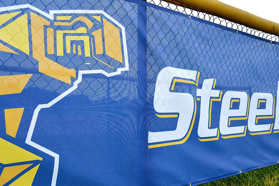
There are many practical reasons to update your baseball and tennis fences with a mesh windscreen banner, such as reducing wind flow, blocking unsightly views, and providing a backdrop to help athletes concentrate.

While adding functionality to your fences is valuable, our customers get the most excited about transforming their facilities through impactful windscreen designs. After carefully incorporating a program’s branding, a large-format windscreen instantly adds the color and excitement of a big-time program.
There are specific design considerations to keep in mind when speaking with your provider. Below are some quick tips to get the maximum visual impact from your new windscreen.
Determine Appropriate Text Height
Because baseball windscreen banners are typically viewed from a great distance, maximizing legibility is the most important factor when it comes to initial design. Start by deciding on the approximate distance you would like your banners to be read from. Your windscreen provider should be able to take this distance and calculate a text height to make sure your windscreen can be easily read.
For example, 3 foot tall lettering has the best impact up to 360 feet and is legible to approximately 1,500 feet. The text height for most windscreen falls somewhere between 3 and 5 feet, but yours may vary depending on your desired viewing distance.
Choose the Color Scheme
Determining an appropriate color scheme is another important design consideration. Text color that has high contrast from the background color will increase readability. If your text and background colors are too similar, they may visually blend, making your banners difficult to read.
If your team’s primary colors are of similar tone, you may want to consider including a neutral black, white, or grey outline around your text to increase the contrast.
Find the Best Font Choice
Working in conjunction with text height and the color scheme, the font chosen also plays a role in the legibility of your windscreen. It is best to choose a bold font with little adornment rather than thin or script font options. Customers most often prefer thick athletic block-style fonts which work great for windscreen design.
Decide How to Use Logo Options
It is popular to incorporate a school or team mascot into the design of a windscreen. A favored look involves blowing out the logo to oversized proportions, so it is cropped by the windscreen edges. This design technique helps to ensure your logo is visible from a greater distance.
Because every logo is different, cropping may not be a good option for your project. A good design team will be able to recommend other ways to make sure your logo stands out.
There is no need to overcomplicate a windscreen design. Too much detail will be lost when viewed from far away. By keeping the above tips in mind, you will end up with a high-impact design at your facility. Team Fitz Graphics is a provider of mesh windscreens for athletic programs nationwide. Our in-house design team would be happy to put together a custom design plan for ballfield or tennis court fencing. Give us a call today for more information and a free quote.