Back in July 2015, the Madeira Planning Commission unanimously approved a new fitness center and weight room facility to be built attached to the existing Madeira High School. The 4,000 square foot project was originally estimated to cost the district $500,000. By January 2017, a brand new 6,000 square foot facility had been built costing the school district virtually nothing—just the price of the building permit. The entire project had been built through personally donated funds, materials, and labor.

Team Fitz Graphics was called in during the construction phase to develop eye-catching graphics to complement the new facility. Working with Joe Kimling, Madeira’s athletic director, and Kenji Matsudo, Madeira City Schools Superintendent, we discussed their goals for the project. Weight rooms have become part of the recruiting process to gain, and retain, talent within school districts. With that in mind, Kimling and Matsudo wanted graphics that were bold and had visual impact, but also recognized their athletes.
One unique challenge that Madeira presented from a design standpoint is that they have two different mascots. The boys teams are known as the “Mustangs” whereas the girls teams are the “Amazons.” Different stories exist on where the Amazons name came from, but the prevailing story is from back in the early 1970s. Madeira’s girls teams were dominating their competition and referred to as “Amazons” compared to their rivals. Knowing this was meant to be an insult, they grabbed onto the reference and took pride in being known as legendary female warriors. The name has stuck ever since.
Two different and unrelated mascots can be tough to incorporate into a cohesive design scheme, but in 2016 Madeira underwent an extensive rebranding campaign. The new branding package featured individual Mustangs and Amazons logos as well as a combined logo to use for the program as a whole. The new weight room became an awesome opportunity to make a clean break from the old look of the program fully utilizing the new branding package.

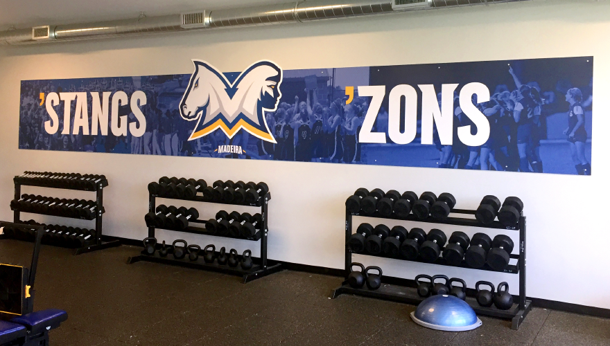
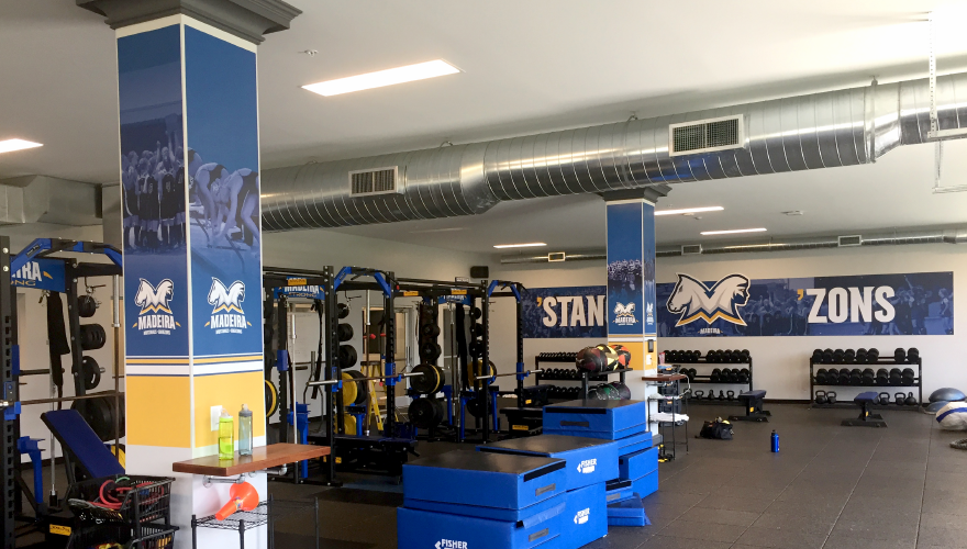
The main graphic for the project is displayed on a large and dominate wall in the weight room functioning as a feature wall for the room. Team Fitz went back and forth with Madeira with a few design options until a final design was decided on. The design features a background with player imagery that has been formatted in monochromatic blue tones matching the team colors. The images chosen are of players in huddles and celebrating. By choosing team focused images, the focus remains on the team rather than any particular individual.

Prominently placed at the center of the wall graphic is an oversized sign featuring the newly redesigned mascot logo. This sign was routed to match the shape of the logo and placed so it breaks out of the rectangle shape of the background. Flanking either side of the logo are the words “’STANGS” and “’ZONS”, nicknames for the boys and girls mascots.
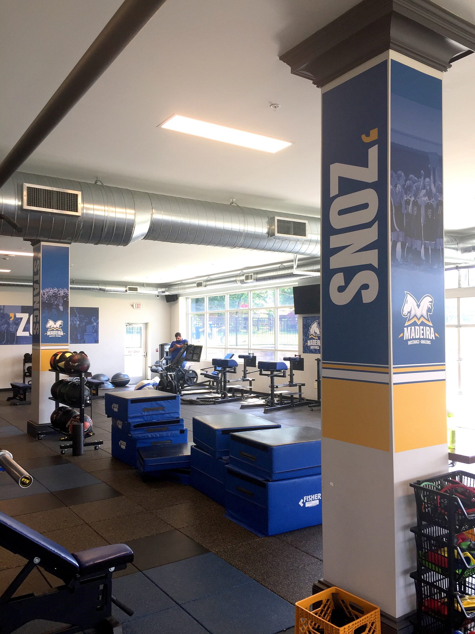
The other main architectural feature we focused on were two large support pillars in the center of the room. Similar team images were used on three of the sides and then the abbreviated mascot name on the fourth side. Like in the main graphic, Kimling and Matsudo were careful not to single out individuals, but rather capture the emotion of team successes.
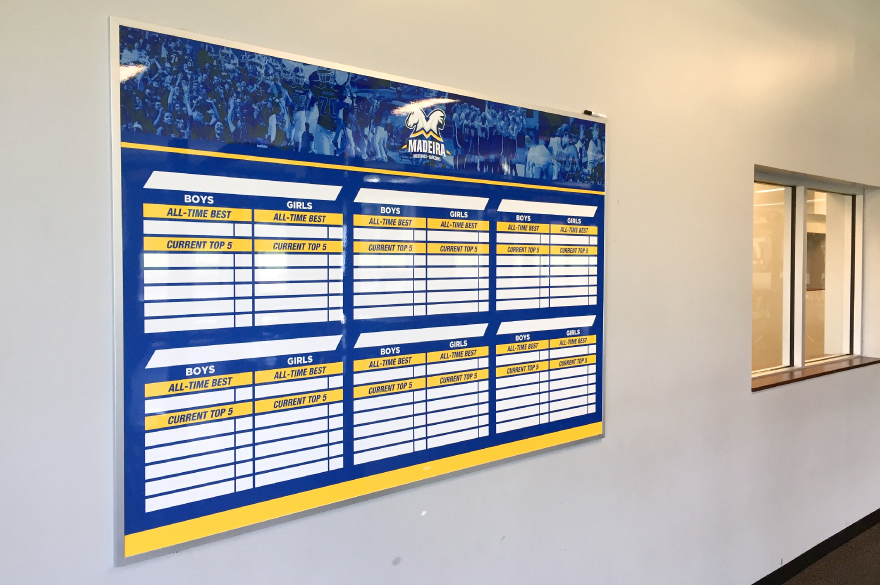
In addition to these feature graphics, we also designed and installed two individual mascot signs to go on either side of a garage door used to access an outdoor workout-turf area. On the opposite wall, near the entrance, we placed a custom dry erase board to write workouts on as well as a custom strength record board. In addition to reinforcing the Madeira’s brand, these custom dry erase boards are also functional allowing coaches to better communicate the day’s workout and motivate their athletes.

Having the opportunity to work on this project was a tremendous experience. The way the community came together to donate the resources to get this built illustrates how the people of this closely-knit community feel about their athletes. Madeira has been an outstanding client for years, and we look forward to seeing the next project the community gets excited about.
Contact Team Fitz Graphics if your weight room could use a little love. We would love to work with you on a plan that gets your players and coaches excited and motivated in the weight room.