When looking to create branding guidelines for your school, you may feel overwhelmed. The best place to start is by creating a strong visual identity. A visual identity is a collection of graphic elements that include a brand’s logo(s), colors(s) and font(s). The most important thing to remember is that you need to keep these things consistent to start developing a strong, positive brand for your school. This will help your school and team to not only be recognized, but more importantly, remembered.
INVOLVE THE LEADERSHIP
Meet with and discuss proposed guidelines with the decision makers in your school. Gather input from those who will be affected, such as team coaches and club leaders, as well as the administration. Every school is different, so you will need to work together to decide exactly what guidelines work for your situation.
If budget allows, a professional graphic design company will be able to help build your visual identity. Often times this is not realistic, so here are the main visual elements to keep in mind when putting together your brand guidelines.
LOVE THE LOGO
The main graphic element to consider is your logo. Your logo is not your brand–your team and your school is your brand. Your logo is the symbol that represents your brand. Many schools don’t have a singular logo that is used across the board. Instead individual coaches and administrators have chosen different images to represent their mascot over the years. There may be 10 different tiger logos throughout your school for instance. This causes the school brand to become disjointed and not as strong as it should be. Work together to pick one logo and use it school wide. The best format for most vendors will be vector-based (i.e. AI or EPS), rather than raster-based artwork (i.e. JPG or GIF). This allows your logo to be scaled up and down to any size without loss of quality.
DISPLAY YOUR COLORS
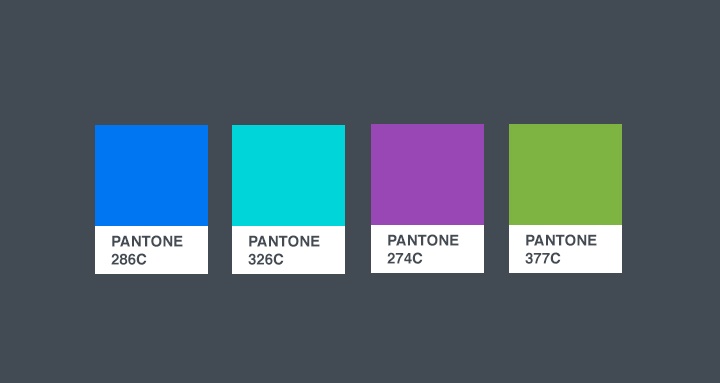
Color is another powerful way to develop your school’s brand. Everyone knows that The Ohio State University is Scarlet and Grey and University of Alabama is Crimson and Cream. Make sure that your school has specific colors that are used. Choosing Pantone colors is the most reliable way to ensure your color remain consistent regardless of which vendor is producing your product. This will help you avoid having a gym full of “12 different purples.” Consult with a design company to help you decide which Pantone colors best fit your school colors (i.e. “Scarlet” = PMS 200c).
LETTERING MAKES A DIFFERENCE
Fonts are yet another tool for developing visual continuity for your brand. Decide what fonts best represent your school and stick with them. Every brand should have at least one “font family” designated to represent it. You should also have an alternate font family in case your preferred font is unavailable.
Remember, the main focus of building a strong visual brand should be on the continuity of your look. Keep your logo, colors and fonts consistent and you are off to a great start.